Monday, December 13, 2010

Wooly Worms

Country folk believe you can predict the severity of the winter by the bands of color on the wooly worm (Pyrrharctia isabella, the larva of the Isabella Tiger Moth). Wooly worms are brown and black, and may be found with alternating-colored stripes.

The wider or thicker the brown band (which is usually in the middle), the milder the winter is expected to be.

Last winter the wooly worms were solid black, predicting a cold, snowy winter - which is exactly what we got.

This year the reports are a little more mixed, with a little more brown being seen on the wooly worms - although the reports are mixed. The official Wooly Worm web site, hosted by the Wooly Worm Festival held every October in Banner Elk, NC, has a more detailed and fine-grained worm-based forecast. It says:

Based on the width and order of the caterpillar's black and brown stripes, Jack's forecast for the coming winter (starting with the winter solstice on December 21) says there will be cold and snow through the holidays and on into late January. There will be a bit of a warming trend in the last week of January and first week of February with a chance for ice. February will continue cold, becoming extremely cold in March. The weeks leading to the spring equinox on March 20 will see the winter close with lots of snow.
Checking the Farmer's Almanac, we find a similar prediction:

Old Man Winter doesn’t want to give up his frigid hold just yet, but his hold will mostly be in the middle of the country.

According to the 2010 Farmers’ Almanac, this winter will see more days of shivery conditions: a winter during which temperatures will average below normal for about three-quarters of the nation.

A large area of numbingly cold temperatures will predominate from roughly east of the Continental Divide to west of the Appalachians (see map). The coldest temperatures will be over the northern Great Lakes and the Upper Peninsula of Michigan. But acting almost like the bread of a sandwich, to this swath of unseasonable cold will be two regions with temperatures that will average closer to normal—the West Coast and the East Coast.

Perhaps the Farmer's Almanac uses wooly worms? I certainly wouldn't be surprised.

Another source says the wooly worms in West Virginia are all black. Perhaps the wooly worms are regionally precise? I have also heard that some all black ones were seen around here, as were some with a thick brown middle band, which indicates a warm spell in the middle of winter.

Comparing with scientific sources, the UAH global temperature anomaly shows a global average slightly cooler than last year for the last few days, but pretty close to the average for the last several years. This gets us back to the basic issue that local climate and global climate can be very different things, and we don't necessarily know exactly what that means. Last winter was one of the coldest in the modern record in the US, Europe, and China, but was warmer than average globally, because there were large areas in the higher latitudes (Northern Canada, South Pacific) that were significantly warmer than average.

So far it feels colder than usual around here and it isn't even winter yet. The forecast for tonight is 15 degrees F. Tomorrow it is supposed to be 13 deg. F. In many recent years past we have had shirtsleeves weather in December - but not in the last 3 or 4 years. Apparently it isn't just me: there have been a record number of new weather records this month, mainly for low temperatures and snowfall: check out this chart.

So what can we expect for the rest of the winter? (Actually, "the winter", since it is still fall.) According to the wooly worms it will continue frigid until at least late January.

Sunday, December 12, 2010

Very Large Globes

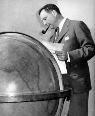
Longtime readers (if there are any still around) may remember my fascination with Juan Trippe's globe:


To review, Juan Trippe, when he was the head of Pan Am, had a very large antique globe in his office in the Chrysler Building. He used the globe and bits of string to plan out Pan Am's pioneering routes around the world.

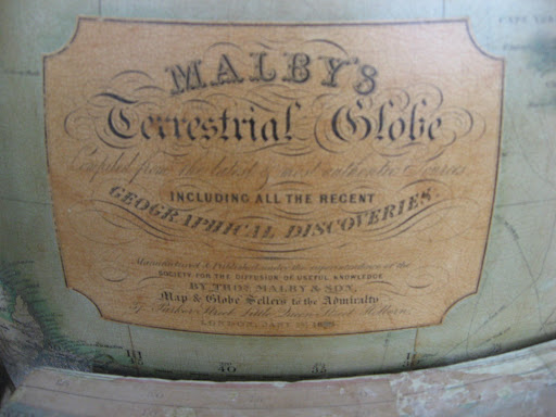
That globe is now in the Smithsonian Institution, where I saw and reported on it in 2008. Close examination revealed it to be a "Malby's Terrestrial Globe", which was not terribly significant to me at the time, but probably should have been:


Markings on the globe indicate it was manufactured in "18*4" - the third digit had been obfuscated by wear. I theorized at the time that it was manufactured in 1884 or 1894, but that was incorrect.

Thomas Malby was a globe and chart maker in London who first estabilished his business in 1810. In 1849, he re-issued the 36" 1825 Addison globe "for the Great Exhibition", which was held in 1851 (in partnership with the Society for the Diffusion of Useful Knowledge, or SDUK). Reportedly Malby sold these globes until 1862, after which they were sold by James Wyld, another famous 19th century London globe maker.

There are quite a few Malby globes to be found around the world, but the giant 36" models are very rare, and very valuable. According to the University of Utah, who have two of them, there are only eight left in the world (three in the US and three in the UK, in addition to the two at Utah, according to them). I'm not sure this is correct.

Yesterday I was at the Biltmore House in Asheville, North Carolina, and was very surprised to see a 36" Malby globe in the library there. Perhaps more amazingly, a 36" Malby globe was recently sold at auction in New York - for $103,700. Including the Juan Trippe globe, that's three right there. Here are two more - although they are listed as "by James Wyld", they date from 1860 and I believe Wyld globes were actually made by, and labeled, Malby in 1860.

So Juan Trippe's globe would appear to probably be dated 1854, which is when Malby's big globes were at their most popular. (Here's an advertisement for them from 1850.) While there are probably more than 8 of them still in existence, they are still incredibly rare and valuable.

Globes are not cheap under any hardly any circumstances. The closest modern analogue to the large Malby globe is the 32" Replogle Diplomat - which runs around $8000 new. Someday when I have $8k lying around I'm going to get one so I can play Juan Trippe at home...

And Malby's? They're still in business in London, now known as the London Name Plate Manufacturing Co., Ltd. They no longer make globes (as far as I can tell) but the company is run by the 7th generation of the Malby family. Cool... Now if we could just get them to make more 36" globes!

Monday, November 1, 2010

JFK

This past weekend I visited Dallas and Dealey Plaza. I had always wanted to go there, to check it out for myself. It was very interesting.

I've never had a big opinion about JFK conspiracy theories although I tended to believe the basic premise that Lee Harvey Oswald did in fact shoot JFK.

Whether he was part of a larger conspiracy, whether well organized or not, I've been pretty agnostic. There are a lot of facts that seem to point to a conspiracy: Oswald's defection to and redefection from the Soviet Union, his relationship with Cuban radicals, the trip to Mexico City, etc etc., not to mention his own subsequent assassination by Jack Ruby.

At Dealey Plaza I just wanted to check out the geometry of Oswald's shot and see if it made sense to me. There have been many, many conspiracists who said the shot was "impossible" and I wanted to see for myself.

My impression was that the shot was far from impossible, although Oswald, who was only a mediocre shot in the Marine Corps, was somewhat lucky with the perfect headshot.

Similarly there has been a great deal of controversy about the Zapruder film, alleging it proved the shot could not have come from the 6th floor of the Texas Book Depository. After standing in Oswald's perch on the 6th floor, looking at the "X" on the pavement where the fatal shot hit JFK, and standing on the spot where Zapruder made the film, it looked like it all made sense to me. The Zapruder film shows an explosive exit wound that looked to me to correlate with the trajectory from the 6th floor of the depository. The earlier frames also seemed to be consistent with the earlier shot from the same location, which hit JFK in the back and also hit Governor Connally.

While lurking on the grassy knoll, I met a very interesting man who claimed to be an eyewitness to the assassination, 13 years old at the time, who was across and up the street from where Zapruder took the film. He said he was sure he saw a shooter on the grassy knoll, that a part of Kennedy's skull was blown backwards, behind the car and across the street, and that nearly all the witnesses at the time believed the shooter was on the grassy knoll. He then went on to relate many of the more wild and unbelievable facets of the conspiracy theory, such as that Oswald, Ruby, J.D. Tippitt, etc, all knew each other in Dallas before 22 November 1963. I have no idea whether anything he said was true, but he told a good story.

So my individual objective observations seemed to support, to me anyway, the basic premise of the assassination: that Oswald, on the 6th floor of the school book depository, fired three shots in about 6 seconds and hit Kennedy twice, killing him instantly with the (probable) third shot.

But like everything with the Kennedy Assassination, there are an awful lot of puzzling bits of evidence. To me the poor ballistics analysis has always been problematic. Oswald probably fired three shots, but where did the third (or most likely second) shot go? Something hit witness James Tague, but I've never seen a good analysis of how that bullet got to where it was. (Fascinatingly (to me), Tague, like practically every witness who has made statements that I've heard of, reports facts contrary to the Warren Commission report and may believe in a conspiracy involving a shooter on the grassy knoll. I have no idea if that means anything other than they all see financial gain in promoting a conspiracy.)

There are just so many strange facts about the case - like why did Oswald visit the local FBI office and threaten FBI agent James Hosty, warning Hosty to stay away from his wife? And why was he not arrested for making the threats? And why did the FBI destroy the written, threatening note that Oswald left for Hosty?

Who was the strange man who presented Secret Service credentials to Dallas Police Officer Joe Smith in the parking lot behind the grassy knoll in the seconds after the assassination? No official authority has ever provided an explanation for Officer Smith's testimony, as there were no known Secret Service agents on the grassy knoll, and especially none dressed in casual clothes, as Smith reported.

What about the other strange bullets and cartridges found near Dealey Plaza? Not that I necessarily believe any of them have anything to do with the assassination, but it is strange.

Ultimately, I have to stick with Occam's Razor. If there was a massive conspiracy, it would have had to have been unimaginably massive, and it probably would have come out by now. If there were other shooters, they were way closer to JFK than Oswald and apparently didn't hit anything - and there would have had to have been a massive coverup to conceal the evidence of their presence.

A lot of weird stuff went on - destroyed evidence, coercion of witnesses, botched investigations, etc. - but I think the explanation for it all is probably typical government incompetence and arrogance, not an organized conspiracy. Finding the magic bullet on Connally's stretcher was particularly strange.

I think if there was a conspiracy, it probably involved Oswald as the shooter with "guilty knowledge" about his plans and general strangeness among the various government agencies who had been interested in him before November 22nd. The FBI, particularly, behaved very suspiciously, but then again J. Edgar Hoover was in charge and they behaved oddly most of the time.

But ultimately I'm agnostic. I wasn't there, and it's hard to tell what happened years later. Like most stuff of this ilk, I think the discussion says more about us today than about what happened then.

Thursday, August 5, 2010

While we're at it...

The New Seekers were the reformation of the The Seekers, who I consider the greatest folk band of all time.

The Seekers were all-Australian, and are still revered, and still active, with the original lineup, in Australia. They featured the best guitar lineup in all of folk music, with Keith Potger's 12 string and Bruce Woodley's rhythm, and Judith Durham singing lead vocals always looking like she wasn't trying very hard.

The Seekers produced what I consider the greatest single ever in the history of folk music in 1965 (The Brits agreed - it was the #1 single in the UK that year). You can't play this song loud enough, and the band seemed to understand that - they're practically shouting on the studio versions. It was written by Dusty Springfield's brother Tom for the Seekers and was a #4 in the US and of course #1 in Australia as well.

Here it is... crank it up:


Target Commercial

You've probably been wondering about the song in the most recent Target "Back-to-School" commercial...

It's "Free to Be", by the New Seekers, the early-70s reincarnation of the great Australian 60's folk band The Seekers, featuring the very appealing Scottish vocalist Eve Graham. The New Seekers had several hits on both sides of the Atlantic, including "I'd Like to Teach the World to Sing", which was originally a Coca Cola commercial, but the "Free to Be" song was originally the theme to a 1974 Marlo Thomas children's TV special.

The song has enjoyed a cult following since then, even though it was never an actual release by the New Seekers. Enjoy:

Thursday, July 29, 2010

The Pond

The Pond was a very-little-known Army intelligence unit operating under non-official cover in World War II and after, before it was absorbed into the fledgling CIA.

Recently the archives of the Pond, which were discovered in a barn in 2001, have finally been made public by the National Archives.

I wrote about the Pond and the fascinating story of its archives in my old blog, which sadly is now gone, after the CIA journal "Studies in Intelligence" published an article about it - until now practically the only information ever revealed publicly about the Pond's existence.

Now the documents are finally available - I had doubted they would ever be public. There is a lot of explosive history in these documents, particularly related to the pitched battle between the Pond and the CIA in the late 40's and early 50's. The Pond (supposedly) identified many Soviet agents in the US and Western Europe and fought to have those people investigated, while the CIA sought to dismiss, cover up, and protect those same people, many of whom were much later identified as real Soviet spies. For this reason alone, because the CIA had control over release of the Pond's documents, I expected they would disappear forever.

Of course we don't know what the CIA removed from the records before forwarding them to the National Archive. Presumably they removed everything embarrassing to the CIA, which could have been a lot.

Many people today are making the argument (obliquely) that the Pond is exactly the model we should be using for foreign intelligence, relying extensively on non-official cover vs. the embassy-based cover favored by the CIA.

The record - which may or may not be further bolstered by the Pond documents - however, is that the intelligence bureaucracy hates "non official cover" or "outsourced intelligence collection" and will normally do whatever it takes to eliminate it, as was done with the Pond.

The documents are, so far, only available by going to the National Archives and looking at them but I am hoping someone will put them on the web. Also there should be some good books coming out based on this newly-released information. I can hardly wait...

Sunday, July 11, 2010

Water Temperatures

This summer has been hot. It feels much hotter than last summer, although last summer was one of the coldest in decades in some places. This summer, however, feels a lot hotter than last summer, and perhaps hotter than usual.

I observe temperatures through a variety of non-scientific means. One of my favourite, and least scientific, is the temperature of my swimming pool in North Carolina. Water changes temp a lot slower than air, so it's a good medium to "smooth out" daily and weekly fluctuations.

This summer, my pool got hotter than usual quicker than usual - it was up to the high 80's in early June, which was a notable spike. I expected it to stay hot because of the heat wave that has hardly been broken since then. But something strange happened: it dropped back to the high-70s/low 80s in late June, where it has been for the last several days, even though the daytime temps seem hotter than usual to me. I absolutely don't know what this means or how it happened.

Last year the pool never got above the low-80s all summer, whereas two years ago it went to the high 80s in mid-June and stayed there until September. It seems like its been hot, but the pool doesn't seem to know it.

Another thing I look at is sea surface temps in the Florida Keys. I expect it to be mid-high 80s in July and this week it's been 82-84 - seemingly a couple of degrees cooler than usual. I looked at historical data, however, and the temps are actually very close to historical averages for this week in July, according to the data I found. Unfortunately, NOAA's weather stations are notoriously unreliable in the Keys and a lot of data is missing, which is very frustrating. There does, however, seem to be a warming trend since 1988, which is the first year of data for the stations I looked at (SMKF1 and SANF1). The chart below would seem to indicate that warming trend is strongly indicated by the global average.


Lately I've learned about how temperatures are measured and studied. The "UAH" global temperature average is the community standard. "UAH" refers to the University of Alabama at Huntsville, where they work hard to keep track of these things, mainly relying on NOAA satellite data, which we have only had for about the last 30 years.

Here is a helpful interactive chart from UAH on recent temperature trends. It shows 2010 as warmer than usual even for recent years, which is strongly suggestive of a warming trend, although the graph has turned down in the last few days and we are now (as of this week) a little cooler than last year and about the same as the last few years' average. Interestingly, this is just for sea surface temperature. If you go up in the atmosphere, the picture changes dramatically. 2010 is colder than many recent years at higher altitudes (play with the altitude selector on the left side of the UAH interactive chart to see it). I have absolutely no idea what this means or why it is so - maybe someone else does?

But I am hoping my unscientific observations of temperature are correct and the Caribbean and Gulf of Mexico are a little cooler than usual because that will probably mean a comparatively benign hurricane season. Every year recently the Colorado State University predicts an "active" hurricane season but 2008 and 2009 were extremely quiet - well below average. As hurricane season is coming right up, we shall soon see...